Posts in Lifestyle
Day in the (quarantine) life | WFH vlog


How’s everyone doing these days? I was feeling really down a few weeks ago, being bombarded by bad news and feeling I was getting nowhere by staying at home all the time. But it got better as I cooked more, read more, finished my song, and became more productive in my everyday work. This week has made me feel really fortunate and grateful for all the resources I have that makes it possible to WFH, which is not accessible to other people who may have lost their jobs because of this virus. I’ve also really taken for granted being able to go to restaurants with friends and doing gigs... but I think it’s best I give all of that up for now. Hope to see y’all in person soon, and stay healthy.

♥ Cindy

 
Editing Photos on your iPhone — Part 2: Removing distracting objects in travel photos
 
Editing photos on your iPhone — Part 2: Removing distracting objects in travel photos


Backstory for this “Editing Photos on your iPhone” series:

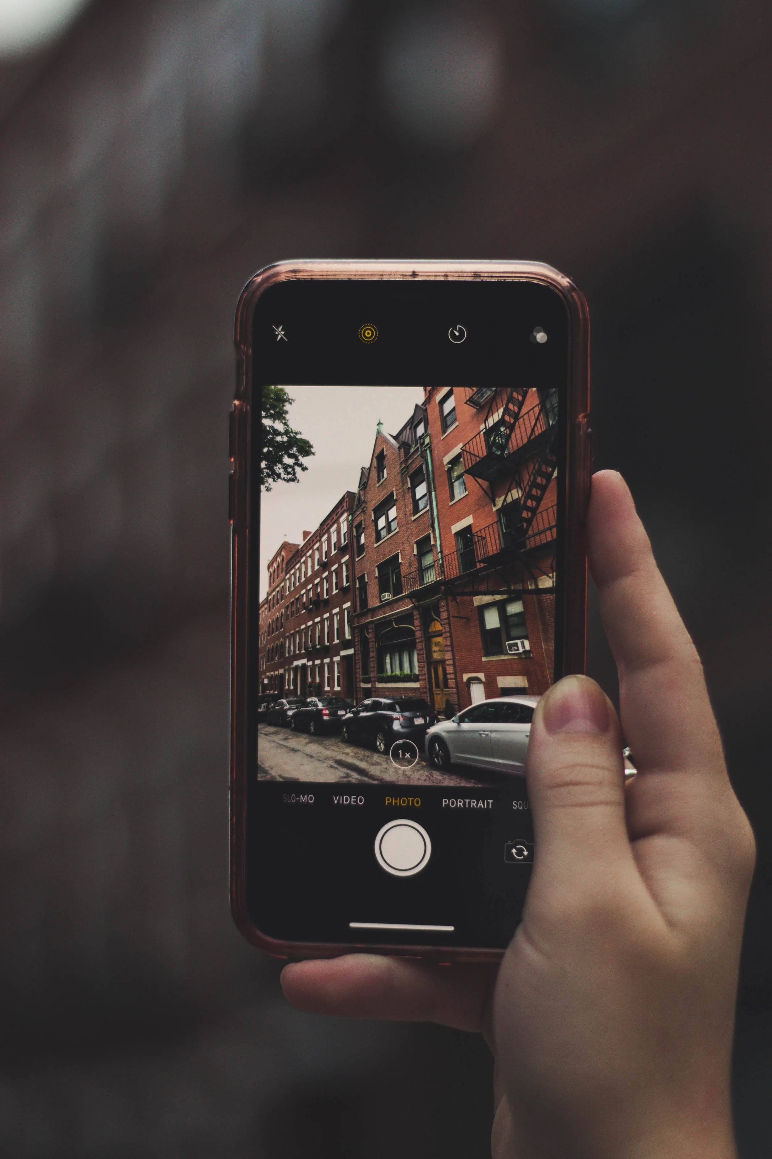
People often ask me what camera I use to take the photos for this blog. And most of the time, they’re surprised to find out that many of the photos were taken and edited on my iPhone. The iPhone camera is no joke, especially with features like Portrait mode. It’s also super convenient for taking photos while traveling or cooking (the idea of having an expensive DSLR by your stove kinda turns me off). You can also find some amazing apps on the app store that will work just as well as Photoshop and prevent you from airdropping photos back and forth between your phone and your computer.

Did you learn some basic color correcting tools in Part 1 yet?

Part 2 TL;DR:

“I took a crappy photo in a nice place. But it has so many distractions in the background that I wish I could get rid of! What should I do?”

The unedited photo:

 
Editing photos on your iPhone — Part 2: Removing distracting objects in travel photos


Goodness gracious! There are so many things wrong with this photo. It’s so hard not to just delete it. But what I do like about this photo is that it’s pretty candid. I really like the movement of the walking, and it really conveys the feeling of being on a trip.

Let’s identify what’s wrong with the photo:

  1. It’s too dark, and most of the photo is in the shadows

  2. There’s trash everywhere on the floor! (For reference, this was shot in the Monti neighborhood of Rome in the morning—so after a wild night out drinking for a lot of Romans)

  3. There’s a trash can taking up a lot of space on the left side of the photo

  4. The photo is lopsided (the walls of the buildings are tilted)

The apps that I’m going to use to fix these issues are:

 
Editing photos on your iPhone — Part 2: Removing distracting objects in travel photos

Step 1: Make the trash disappear

The trash in this photo really doesn’t contribute to the “traveling” vibe of this photo at all and is only a distraction. Let’s remove it by following these steps in TouchRetouch:

  1. Go to the object removal tab

  2. Tap on the brush tool

  3. Brush away the trash by adjusting the brush size and zooming in for precision

  4. Compare before and after by tapping the second icon from the right in the top toolbar


Editing photos on your iPhone — Part 2: Removing distracting objects in travel photos

Step 2: Straighten and crop the photo

To fix the tilt of the photo, lets open it up in the Lightroom app:

  1. Select the crop & rotate tool

  2. Crop parts of the image that are uninteresting—like the trash can on the left. This will also make the composition of the photo better and place the subject of interest on the lower left third of the photo (which is more interesting than in the center)

  3. Rotate the image until the lines of the buildings line up with the grid lines of the image.


Editing photos on your iPhone — Part 2: Removing distracting objects in travel photos

Step 3: Color correction

Let’s also do some color adjustment in the Lightroom app as well.

In the Light tab:

  1. Bump the exposure to brighten the image

  2. Bump the contrast to make the image pop a bit more

  3. Increasing the exposure may have caused the buildings in the distance to become too washed out. Because of this, I reduced the highlights so we can see more of the building’s details.

  4. Reduce the shadows that was overwhelming most of the image before

In the Color tab:

  1. Make the image warmer to give it a more summery vibe (the warm tones of the building really go well with my dress!)

  2. Increase the saturation to make the image more colorful


Editing photos on your iPhone — Part 2: Removing distracting objects in travel photos

Step 4: Creative last tweaks:

In VSCO:

  1. Choose a filter that compliments your photo. In my case, I chose the “Fuji Provia 400x” filter, which gives my photo a film-like vibe. You can also adjust the warmth of this filter.

  2. Final adjustments:

    • Increase the exposure

    • Make the shadows weaker

    • Sharpen the image

    • Bump the contrast a bit more


original photo vs Final photo with edits:

Editing photos on your iPhone — Part 2: Removing distracting objects in travel photos


And voilà! A disastrous photo turned into one that you can actually post on Instagram! The edited photo gives off so much more of a summer vibe, and is free of distractions like the trash on the floor. The composition has improved as well: having the subject offset from the center of the image puts more emphasis on where she’s going rather than on her. (Why am I speaking of myself in the third person…?)

For more iPhone photo help, please check out part 1 of this series!

♥ Cindy

 
Lifestyle, 2Cindy ZhangComment
Editing Photos on your iPhone — Part 1: Basic color correction
 
Editing photos on your iPhone — Part 1: Basic color correction


Backstory for this “Editing Photos on your iPhone” series:

People often ask me what camera I use to take the photos for this blog. And most of the time, they’re surprised to find out that many of the photos were taken and edited on my iPhone. The iPhone camera is no joke, especially with features like Portrait mode. It’s also super convenient for taking photos while traveling or cooking (the idea of having an expensive DSLR by your stove kinda turns me off). You can also find some amazing apps on the app store that will work just as well as Photoshop and prevent you from airdropping photos back and forth between your phone and your computer.

Part 1 TL;DR:

“I went to a beautiful place on a gloomy day. All my photos look depressing af.”


The unedited photo:

How to edit your photos to look amazing on an iPhone
 

Ah yes, we chose to go to one of the most beautiful destinations in Australia on a gloomy day and as a result, snapped some depressing-looking photos. But let’s not delete it yet. We can do a lot of post-processing of this photo (all on our phones!) to make it look gorgeous.

First, let’s identify what’s wrong with the photo:

  1. It’s dark and depressing. Lots of shadows

  2. Waters are greenish. That’s kinda weird… and kinda gross.

  3. Left side of photo is really bright from the sun while the right side is super dark

 
How to edit your photos to look amazing on an iPhone
 
IMG_7788.PNGHow to edit your photos to look amazing on an iPhone

First of all, let’s do our most basic editing to ensure the photo’s lighting is corrected before we start doing more of the creative stuff. I like to start off with the Adobe Lightroom CC app to do these initial edits. I can save this edited photo as a “baseline” to start with. Then, I can go into more creative apps like VSCO to do some extras at the end.

  • Exposure (+0.78)—making the image brighter overall

  • Contrast (+4)—making the image more vibrant, and colors pop out more

 
Editing photos on your iPhone — Part 1: Color Correction
How to edit photos on your phone — Part 1: Color Correction
 

A lot of the “depressing-ness” of this photo also comes from the fact that there is a huge amount of shadow on the rocks, making you barely able to see their details. We can solve that by doing the following:

  • Shadows (+15)—Increasing this field will make the shadows less prominent, while decreasing it will make them heavier

We can also amp up the colors to make the photo look more exciting and less depressing. YAY COLOR.

  • Vibrance (+26)

  • Saturation (+25)

 
Editing photos on your iPhone — Part 1: Color Correction
 

K, cool. So now our photos is bright and colorful and less depressing. But did it get a little too bright in the process? Maybe. It looks like the sky got a little overexposed on the left side of the image.

We can solve this by using the handy-dandy selective edits tool that Lightroom offers as one of its paid features (around a dollar per month). This step is totally unnecessary. But if you’re a little OCD like me, here are the steps you should take to get rid of that brighter area:

  • In Selective Edits, use the circle tool to select the area you want to edit. You can also adjust the location and size of your circle. Everything in this circle will be adjusted to your liking without affecting the rest of the photo

  • Bring down the exposure in the “light” panel.

Note that this trick isn’t just for exposure edits. You can take advantage of this selective editing tool to give more color to parts of images that need it (this especially works well for food photos).


Edits after using the Lightroom app:

Editing photos on your iPhone — Part 1: Basic color correction
 

Pretty nice eh? The photo’s still not perfect, but it’s definitely a lot better than the original! People will start questioning you at this point: what camera did you use to take this?

One negative thing that stands out about this photo is how green the waters look. Not the most appealing, right? Let’s fix that by opening this photo up in our second app: VSCO.

 
Editing photos on your iPhone — Part 1: Color Correction
 

To make the greens in the water less prominent, and to make the oceans look more blue, go to the “HSL” tab at the very right side of the edits carousel. Note that this feature is also for members only. But I find a lot of VSCO’s member-only features super helpful, especially if you don’t want to import this photo into photoshop on your computer. Plus, you get to edit videos on VSCO too. And a bunch of film filters.

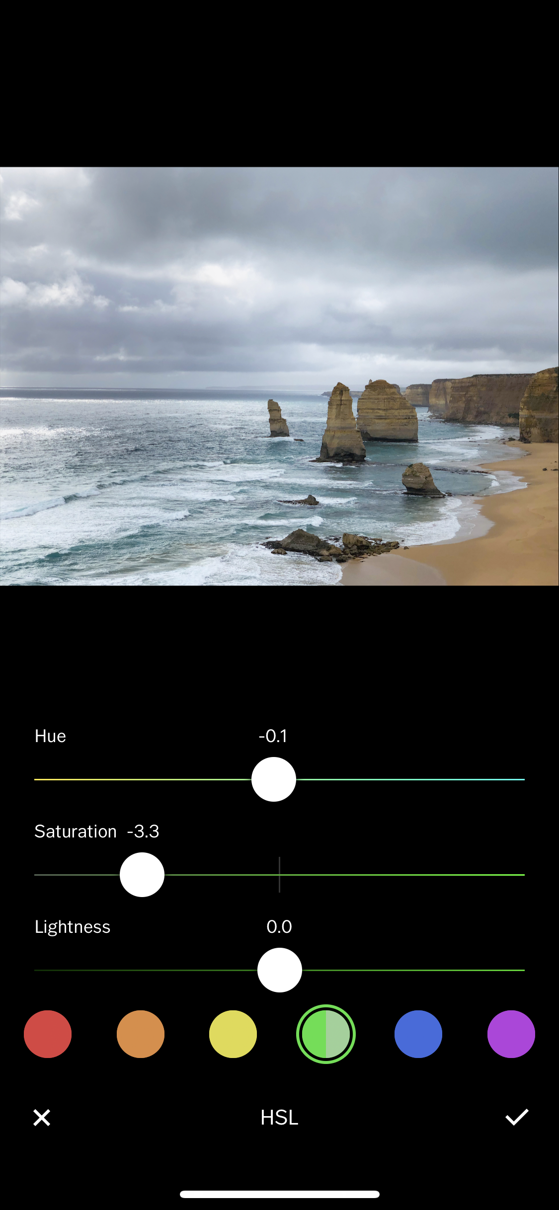
More about the HSL tool from VSCO: “It gives you control to adjust the Hue, Saturation and Lightness of a specific color in the image.  It gives you fine-tuned control over 6 hue regions— red, orange, yellow, green, blue, and purple. By selecting one color at a time, you can isolate adjustments for that particular color without affecting other color present in the image.”

In my case, I wanted less green and more blue.

So, in the greens tab:

  • Saturation (-3.3)—makes the color green less saturated overall

In the blues tab:

  • Saturation (+2.1)—makes the blues more saturated

  • Hue (+2.1)—makes the blues have more of a magenta hue rather than a green hue

 
Editing photos on your iPhone — Part 1: Basic Color Correction
Editing photos on your iPhone — Part 1: Color Correction
 

After you’ve done most of your basic edits to the photo, you can get into the fun part: choosing a filter! I absolutely love the wide range of filters that VSCO provides, and the emotions that they convey. But sometimes, a filter may be a little too vibrant, and you may need to dial it down, just allowing it affect your photo by a teeny-tiny bit. Remember, you don’t want to let your photo speak for the filter, you want your filter to speak for the photo.

  • Decided on the filter, L6.

  • Dialed it down to only +2.2, because it was a little too blue and orange in its full capacity.

  • Dialed down the hue and saturation for blues in HSL, because the filter was making the photo look too blue.

 
Editing photos on your iPhone — Part 1: Basic Color Correction
Editing photos on your iPhone — Part 1: Color Correction
 

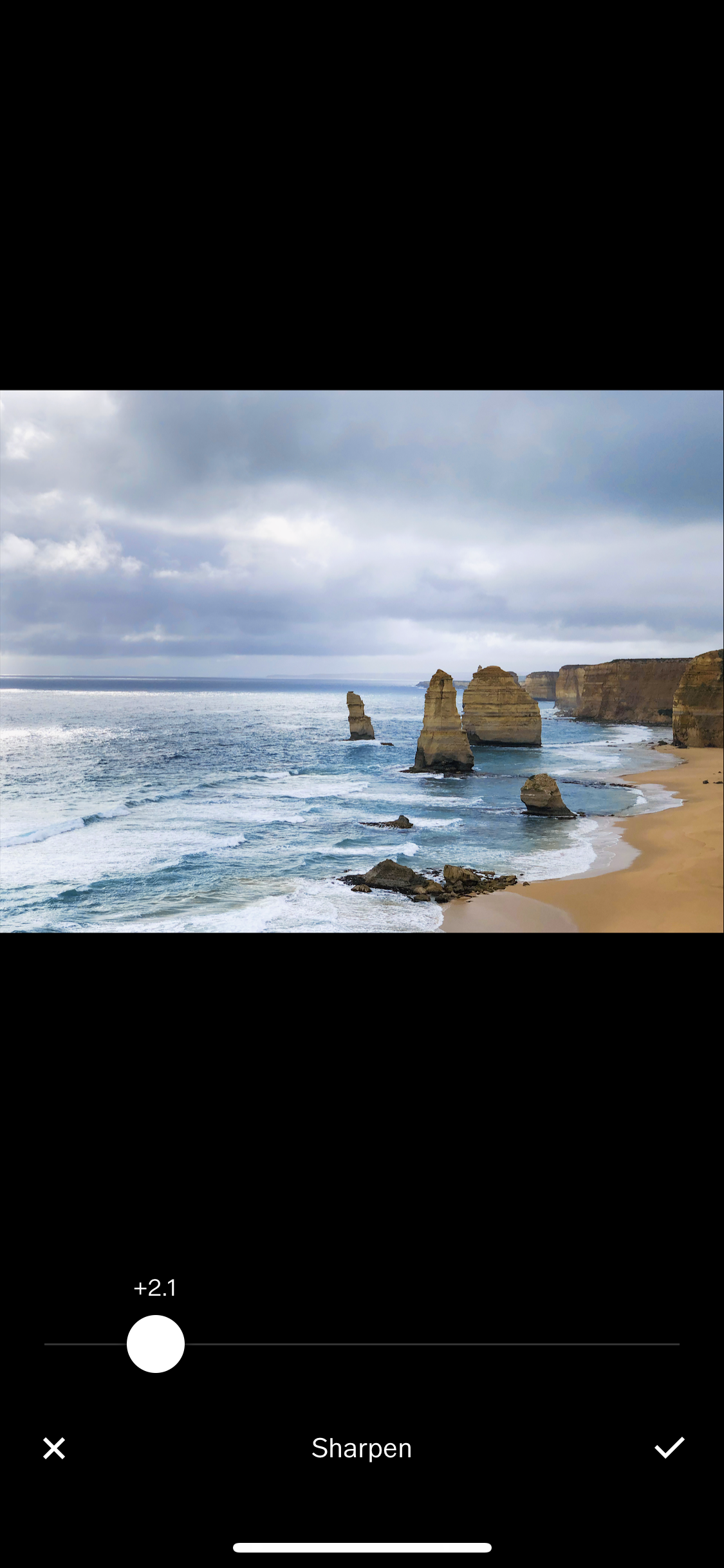
Last but not least, let’s sharpen our photo a little and bring up the saturation just a tiny bit. Don’t go overboard with the sharpening though—it will end up making your photo look hand-drawn rather than like a real photo.


Final photo with Lightroom app + VSCO edits

What do you think? Here’s the original photo and the edited one side by side:

 
Editing photos on your iPhone — Part 1: Color Correction


Thought this was helpful? Go on to part 2 to learn more about how you can make unwanted stuff magically disappear in your photos!

♥ Cindy

 
Lifestyle, 2Cindy Zhang Comment
Tour of my San Francisco Apartment

Video was shot using the iPhoneX + DJI Osmo Mobile 2 for stabilization. Edited with Adobe Premiere Pro CC 2018 and Adobe After Effects CC 2018.

 
San Francisco Apartment Tour


It’s finally heeeere!! The highly-requested video tour of my San Francisco apartment! In this post you’ll also find links to most of the furniture/decor in each room.


San Francisco Apartment Tour


I’ve been meaning to do a house tour for the longest time, but I’ve also been constantly putting it off because I wasn’t ready to consider my apartment in a “finished” state yet. I’m constantly adding and editing, so the apartment ends up looking pretty different from month to month. In the end I realized that it was never going to be in a “done” state, because my style will always evolve, and the apartment will evolve with me. So in September, I sucked it up and filmed the house tour. I didn’t get around to editing it until late October.


kitchen
 
 
San Francisco Apartment Tour - Kitchen


The birthplace of all food content on this blog

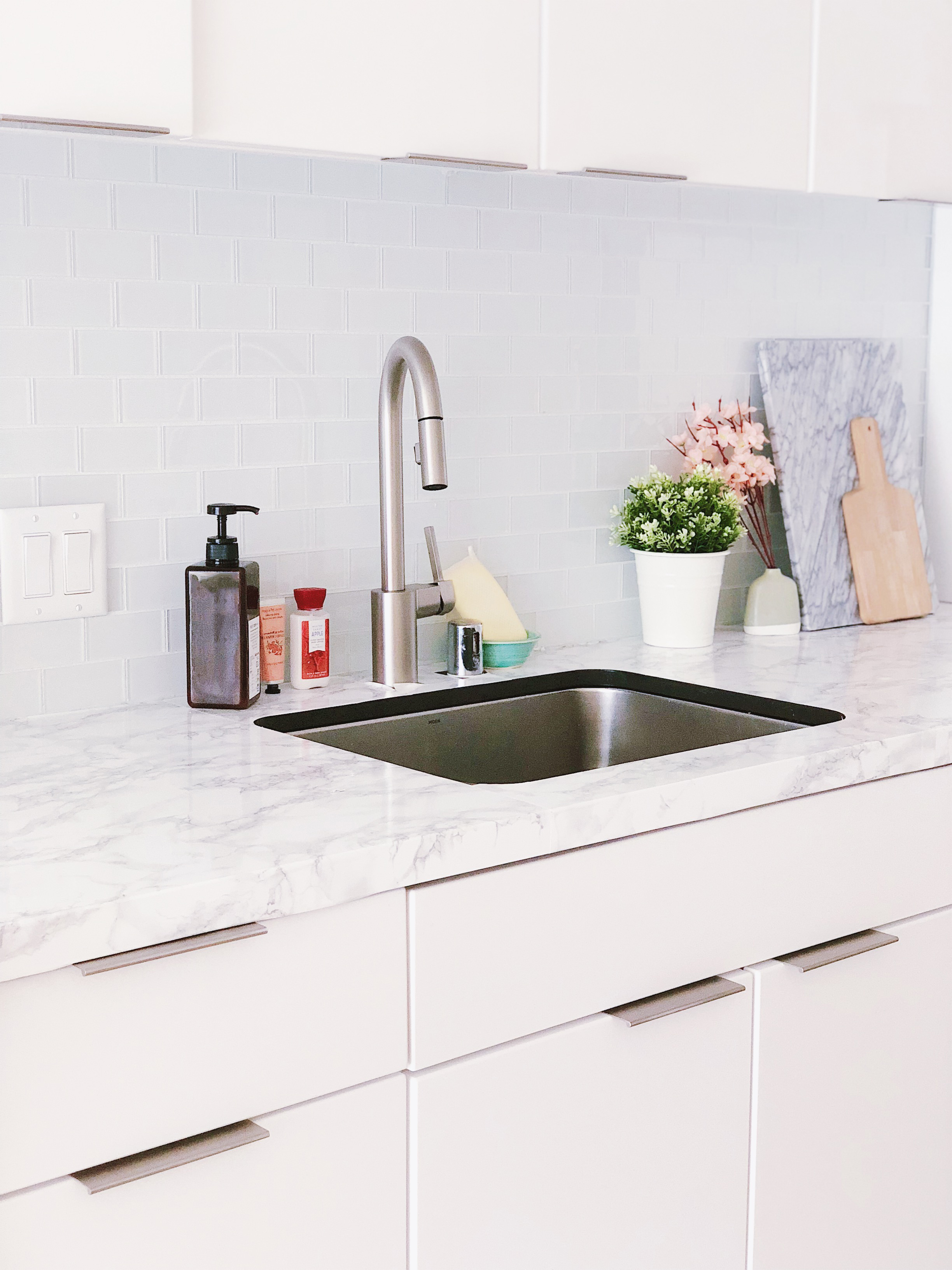
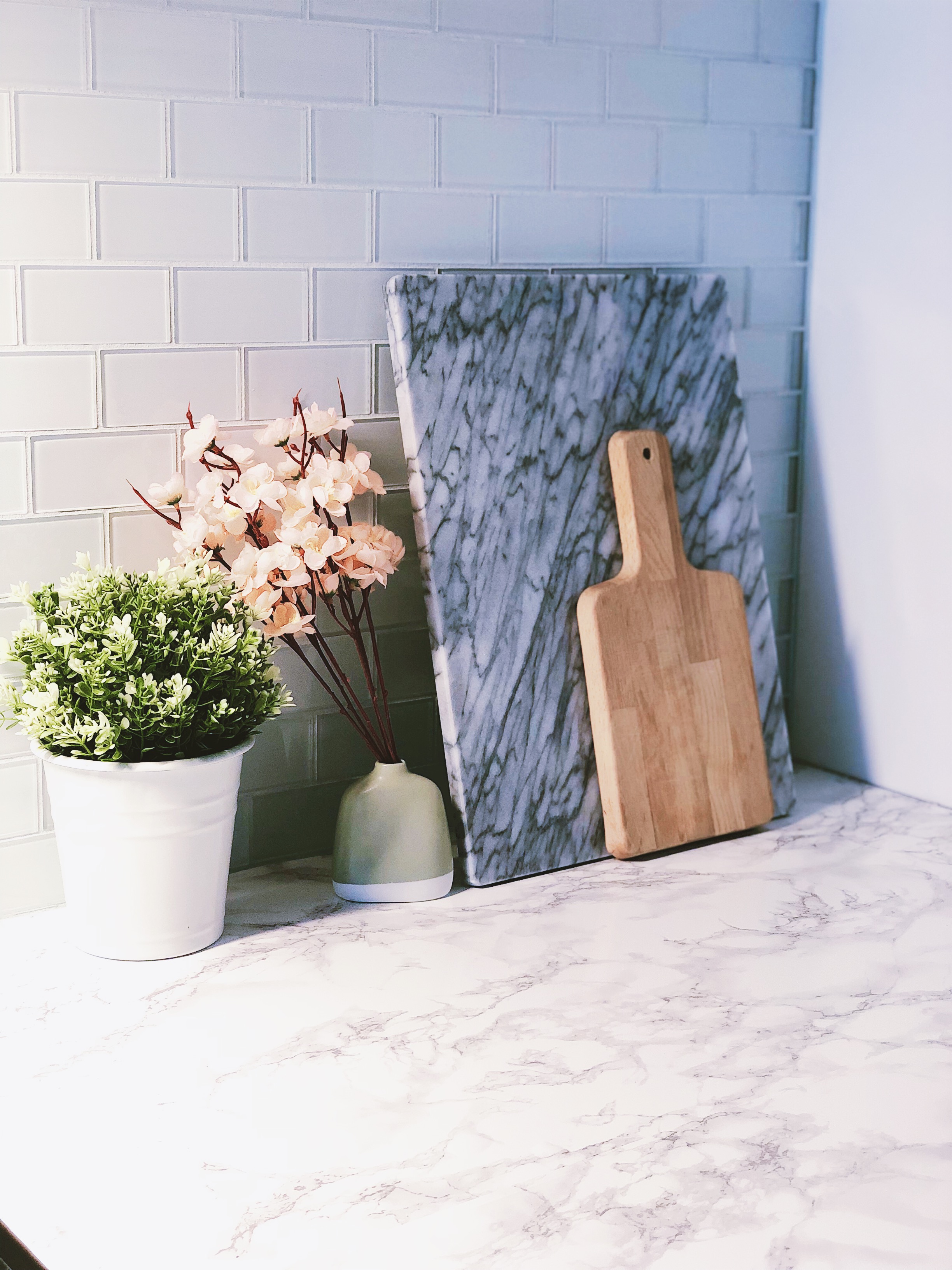
When you enter the house, you’re immediately greeted by the kitchen. Don’t be deceived by the marble countertops though—they’re actually not real. I achieved this effect by covering the original black counter tops with marble contact paper.


Marble Contact Paper - Amazon | Marble Cutting Board - Amazon | Plant + Holder - IKEA | Artificial flower - Daiso | Wooden Cutting Board - IKEA | Soap Dispenser - Muji


JPEG image-A7A722D66B22-27.jpeg


Smeg Retro Toaster in Pastel Green - Amazon | Artificial Flower - IKEA


San Francisco Apartment Tour


Round dining table - Amazon | Eames DSW lookalike chairs - eBay | “Stockholm” Pillow - IKEA | Artificial Cherry Blossoms - Daiso | Fujifilm Instax Polaroid Camera - Urban Outfitters | Mini Succulents - World Market


living room
 
 
San Francisco Apartment Tour - Living Room


Where Creative shit gets done

This is my place to relax after a long day, but also the place to get shit done. All the practicing for gigs happens here, as well as actual work work on WFH Wednesdays. To make this the perfect place to spark creative energy, I decorated the space with a lot of wall art, colorful accents, and plants.


San Francisco Apartment Tour - Living Room


“Pisces” art print - Society6 | Map of New York art print - Society6

For the rest of the prints on the wall, I download the images online and printed them at Walgreens. I then added on cheap frames from IKEA and Michael’s.


San Francisco Apartment Tour - Living Room


“Lisabo” desk - IKEA | Chair - IKEA | Rose gold lamp - Amazon | Wall grid - Daiso | Acrylic Drawers - Muji | Jewelry Holders - Daiso


San Francisco Apartment Tour - Living Room
San Francisco Apartment Tour - The Living Room


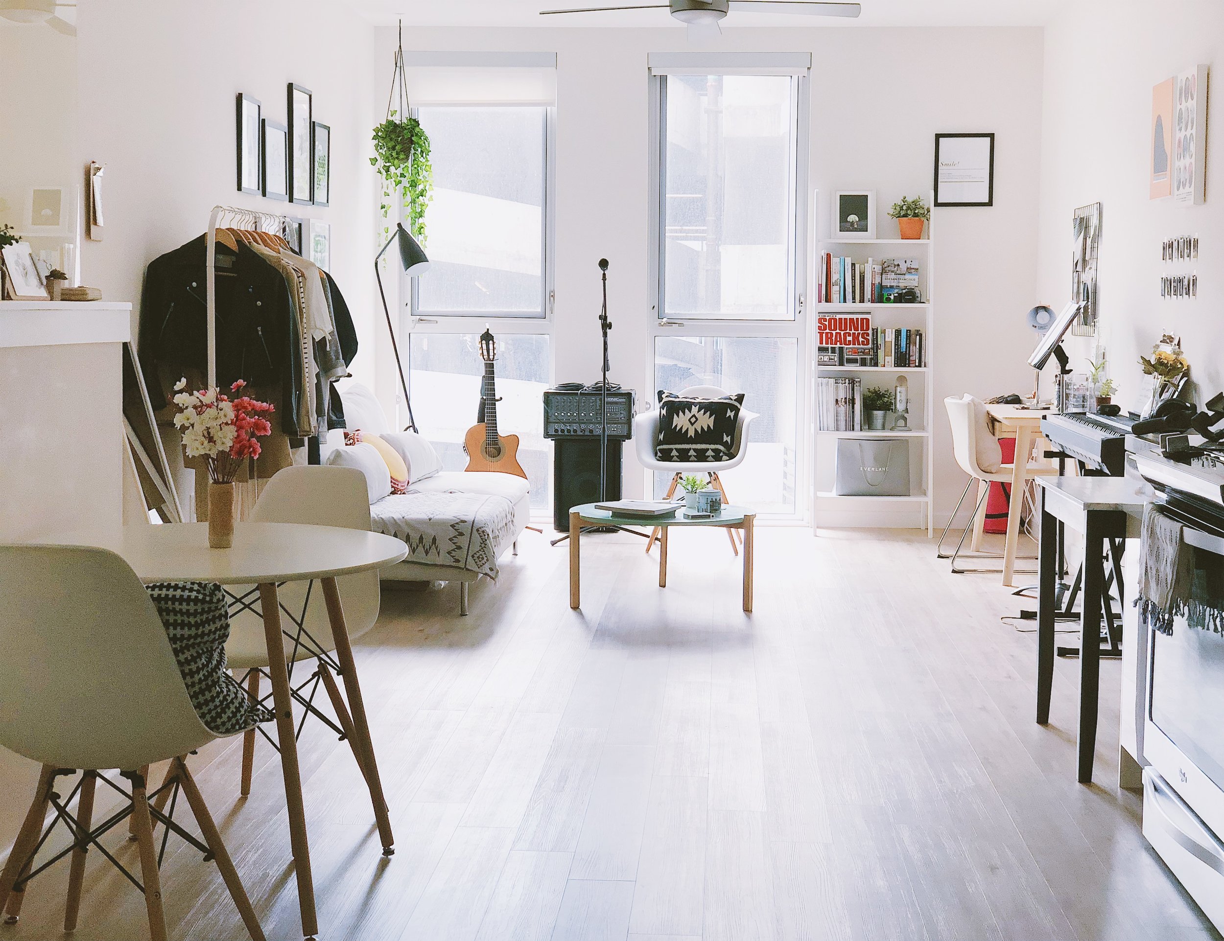
“Soderhamn” sofa - IKEA | Coffee Table in mint green - Anthropologie | Classical Guitar - Lucero LC235SCE | Eames DSW lookalike armchair - Wayfair | Black/Ivory Southwestern stripe throw pillow - Target | Floor Lamp - Wayfair | 8-bit playing cards - Amazon


San Francisco Apartment Tour - Living Room


“Mulig” clothing rack - IKEA | Round throw pillow - Target | Turkish blanket - Out of stock, find similar on Truck & Barter

As a general rule of thumb: try to keep large pieces like sofas neutral. Choose a versatile shade like white or grey so you can get creative with the accents you add on top. This way, you can change them easily when your style changes, and when trends come and go.


San Francisco Apartment Tour - Living Room


Yamaha P71 Electric Keyboard - Amazon | Canvas art - Society6 | Retro red clock - Amazon


bedroom
 
 
San Francisco Apartment Tour - Bedroom


Where the magic (of sleep) happens

Since this apartment is not quite a full one-bedroom, the bedroom is quite small and doesn’t have a door. Because of the lack of space, I tried to keep the room super minimal by opting out of a bed frame and just putting the mattress on the floor. As for the bedside table, I created a lightweight replacement by laying some heavy books on top of a simple stool.


San Francisco Apartment Tour - Bedroom


Coral embroidered round throw pillow - Target | Square light pink throw pillow - Target | White textured throw blanket - Amazon | Bedding - IKEA | “Marius” Stool (used as makeshift bedside table) - IKEA | Lamp + plant - Target | Guitar - Yamaha FG800


San Francisco Apartment Tour - Bedroom


Hanging light - IKEA | Amsterdam map art - Society6 | Black and white line canvas art - Society6 | Vase - Amazon


Bathroom
 
 
San Francisco Apartment Tour - Bathroom


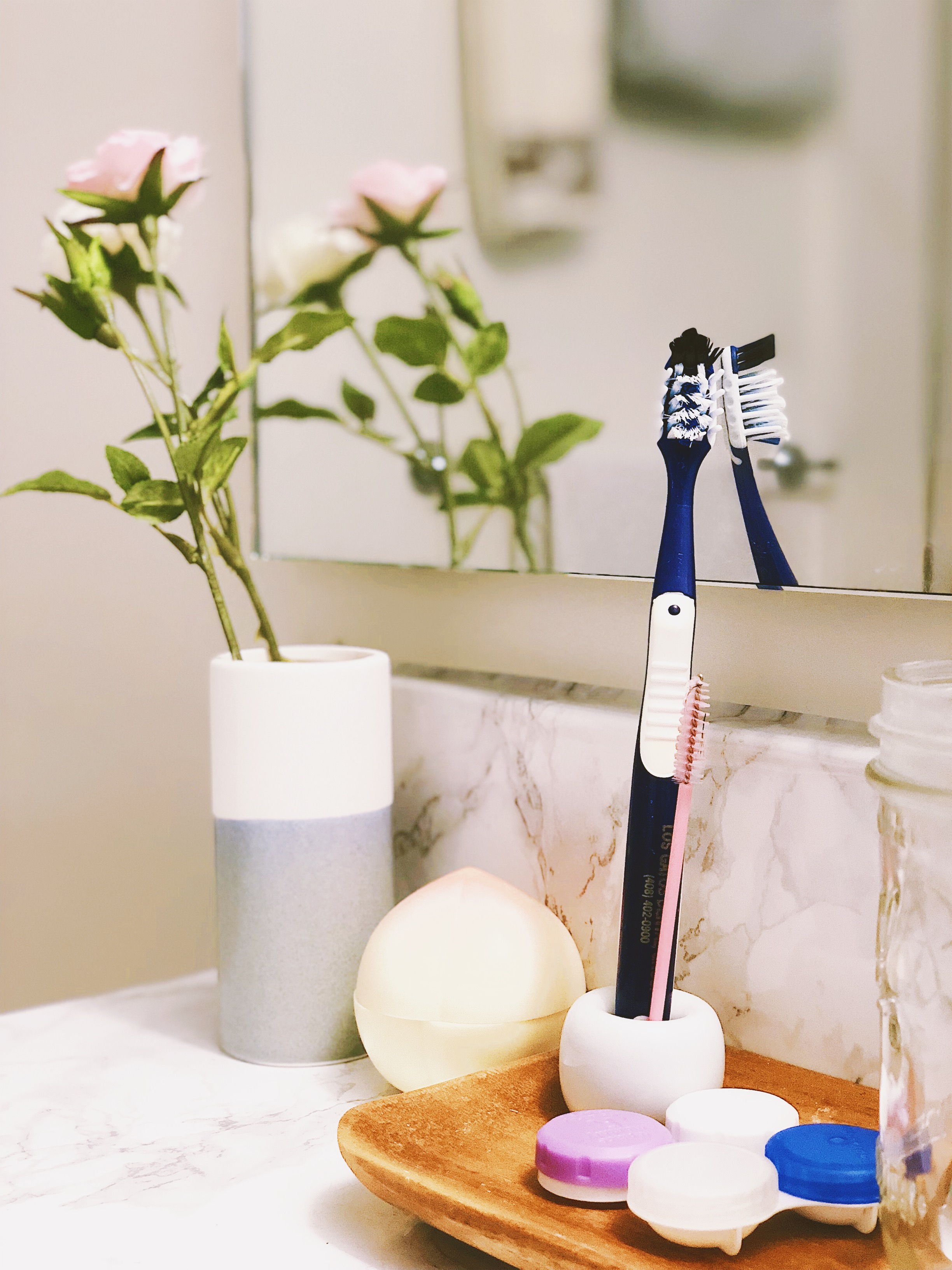
Shower Curtain - IKEA | “Marius” Stool - IKEA | Circle rug - World Market | Marble Contact Paper - Amazon


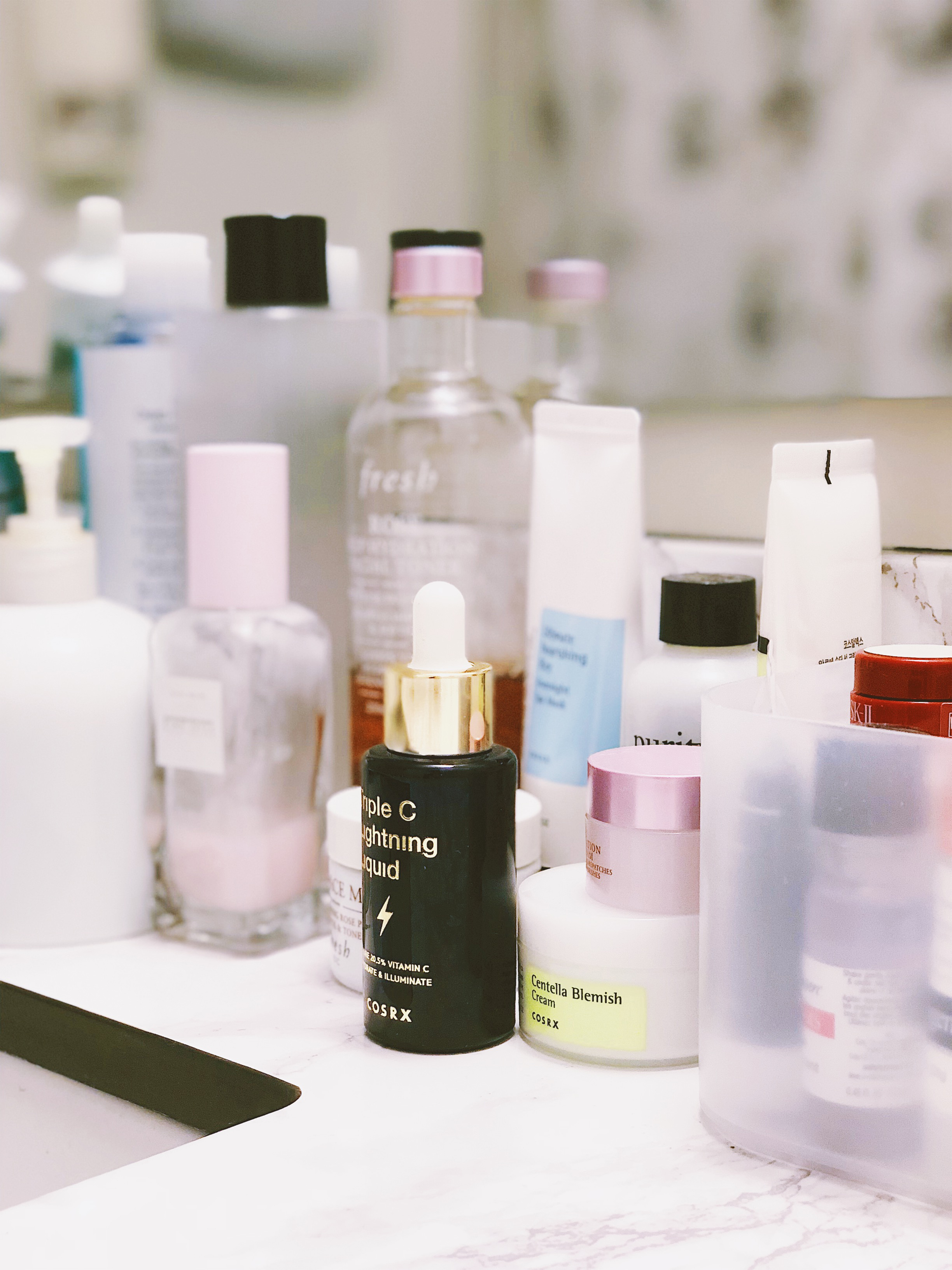
Where the 7-step Skincare Routine Happens

Okay, maybe it’s more like 5 steps for me. But I love unwinding here after a long with my nighttime skincare regimen, and then starting my day on the right foot by taking good care of my skin. My favorite brand for skincare products right now is CosRX, a Korean brand that provides super affordable solutions that are also super effective.


San Francisco Apartment Tour


Hope you had fun watching the tour of my apartment and reading through this post! Hopefully you got some new ideas for decorating your own space, or at least found something you would like to buy for yourself. If you’re interested in seeing my old 200 square feet apartment and seeing how I made such a tiny space work, please (re)visit this post I put up about a year ago—or the Apartment Therapy article!

♥ Cindy

 
We made a K-pop cover and a cake in under 2 hours!

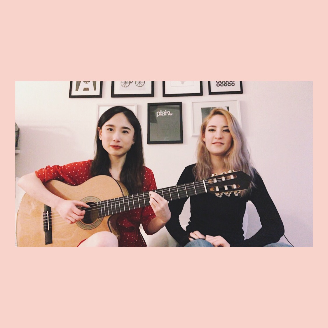
Cover of "Friday" (금요일에 만나요) - IU with Yi-Jeong of History by Anna + Cindy


Last week I got to hang out with a friend from UCSD (also from the a cappella community and a K-pop lover!), Anna, and we made a little somethin somethin for y'all listen to! Kudos to her for editing in the bloopers as well, so stayed tuned until the end for those ;) Make sure to subscribe to her YouTube channel, and to check out her Japan and Korea vlogs!

It feels so good to come back to my K-pop grind and to sing all my guilty pleasure songs again—especially because I've mostly been singing English Jazz standards in preparation for gigs lately. I actually powered through a lot of my early days of learning guitar by using K-pop guitar tutorials to learn the chords to my favorite songs. Shout out to the Caffeine Guitar channel and this video for teaching me how to play this song in particular. 

But... that's not it! We also baked an entire cake!


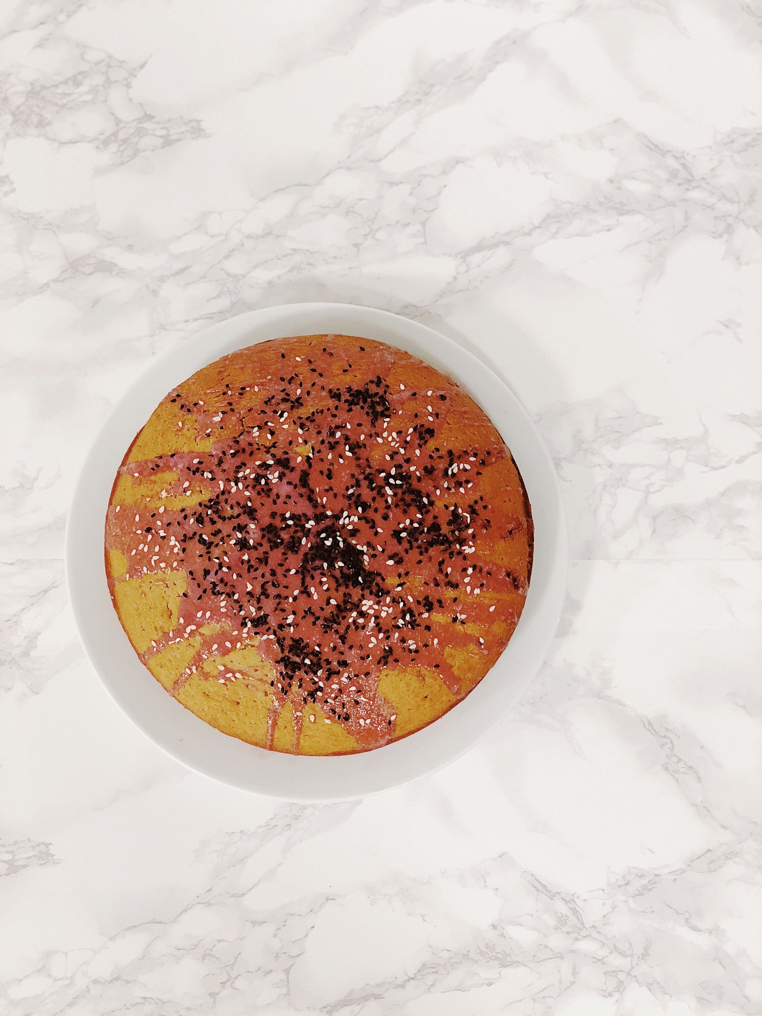
Blood Orange Black Sesame Cake


How badass are we for making an entire cover while before our cake finished baking? This day was really a creative and productive stay-at-home day. It feels therapeutic to create something like music or food, which is nearly not as stressful as creating code, for example.

The story behind this creative day? After posting numerous posts about my baking adventures on Instagram, I found out that Anna loved to bake and cook as well. So we decided to get together to bake this Blood Orange Black Sesame Loaf Cake, courtesy of this recipe I found on Pinterest.


I'm really loving the pink color that the blood orange juice creates for the icing of this cake. I've seen so many bakeries around San Francisco incorporate black sesame into their items these days. I recently tried the Orange Sesame Cake from Tartine Manufactory and the Black Sesame Banana Bread from Provender Coffee. After realizing that sesame gives an interesting (even savory, I would say?) flavor to balance out the sweetness of baked goods, I was eager to come back home to try it myself.


Blood Orange Black Sesame Cake


Aren't you proud of me for composing two blog posts in under two days? <rant> This is because I finally finished a big chunk of a project at work and now I'm finally spending some quality time with my hobbies rather than coding until 4AM on weekends. (I'm still typing this blog post at 2AM on a Sunday, but it somehow feels more reasonable) In other words, my job is too stress-inducing and maybe I should try to transition into a role that's better for someone who has bad anxiety issues already. </rant> Whatever. Good night y'all.

♥ Cindy